Screenshots & Assets
App Icon Design for the App Store and Google Play (2026)
App icon rules and craft for 2026 — Apple's Liquid Glass appearance modes and Icon Composer, Android adaptive and themed icons, the 40px silhouette test, and the rejection traps.
Nobody installs your app from the 1024×1024 hero render. They install from a 40-pixel thumbnail in a search result, sandwiched between two competitors — and that thumbnail is where most indie icons quietly fail, because they were designed at poster size and never checked at postage-stamp size.
This guide covers the craft and the compliance side of icons in 2026: Apple’s Liquid Glass system and its six appearance modes, Android’s adaptive and themed icons, the silhouette test that predicts whether an icon works, and the four design patterns that get icons rejected outright.
For the mechanical part — exporting every required size from one master — the app icon resizer is free, and the screenshot sizes reference covers the adjacent assets.
The 40-pixel silhouette test
Render your icon at 40 pixels, in dark mode, next to five icons from your category. If the shape still reads instantly — not the detail, the shape — it passes. If it blends into the row or needs a second look, redesign before polishing anything else.
Forty pixels is roughly how big your icon is everywhere installs actually happen: App Store search results, the home screen grid, Spotlight, notifications, Settings. The hero size on your product page is the only place users see it large, and by then they’ve already tapped.
Running it takes two minutes: export at 40×40, paste into a screenshot of a real home screen, squint. The squint is the test — it simulates the peripheral, half-attentive way people actually scan icon grids.
Apple App Store icon requirements (2026)
The mechanical rules first:
- 1024×1024 PNG master, no alpha channel — transparency fails validation. Apple generates the smaller sizes.
- Square, un-rounded. The system applies the mask; pre-rounded corners ship visible artifacts.
- No Apple imagery. No Apple logo, no SF Symbols as the primary mark, no replicas of system UI.
- Match everywhere. The App Store icon, the home-screen icon in the binary, and the icon visible in your screenshots must be the same design — mismatches draw guideline 2.3.3 flags.
Liquid Glass and the six appearance modes
iOS 26 replaced the flat icon model with Liquid Glass: the system renders every icon as layered material with depth, light, and reflectivity, and users can set their home screen to any of six modes — default, dark, clear light, clear dark, tinted light, and tinted dark. The clear and tinted modes render icons as near-monochrome glass, which is where unprepared icons fall apart.
Apple’s tool for this is Icon Composer: you build the icon as separate foreground and background layers, and the system generates all appearance variants from that one layered source. The working rules that matter:
- Keep the foreground mark identical across modes — only background treatment should shift between light and dark.
- Use solid, filled shapes and let the system do masking, blur, and specular effects — hand-painted depth fights the renderer.
- Give the monochrome modes a pure-white foreground layer; everything else converts to grayscale automatically, and mid-gray marks lose all contrast.
A flat PNG still works — the system wraps it in glass — but apps that ship deliberate variants look noticeably more at home on iOS 26 devices, and home-screen polish is part of how users judge whether an app is maintained.
Google Play icon requirements (2026)
- Listing icon:512×512, 32-bit PNG — alpha allowed, unlike Apple.
- Full-square art: Google applies the rounded mask and shadow itself; design edge-to-edge and keep critical elements out of the corners.
- Don’t confuse it with the feature graphic — the 1024×500 banner is a separate, also-required asset with stricter content rules.
Adaptive and themed icons on devices
On the device side, Android composites your icon from separate foreground and background layers (the adaptive icon format), masking them into whatever shape the launcher uses — circle, squircle, rounded square. Design the foreground well inside the safe zone; launchers crop the outer region aggressively.
Since Android 13, users can also enable themed icons, which render a monochrome layer tinted to the wallpaper palette — Android’s cousin of Apple’s tinted modes. Ship the monochrome layer or your icon stays full-color in a sea of themed ones, which reads as unmaintained to exactly the enthusiast users who enable theming.
Net: both platforms now want the same thing — a layered source with a strong single-color mark. Build the master that way once and every variant falls out of it; the icon resizer exports the full Apple and Android size set from one 1024×1024.
The 5 design principles for indie apps
1. One shape carries everything
Every icon that survives thumbnail size is one recognizable silhouette — a checkmark, an animal head, a geometric mark. Composite scenes and logo-with-wordmark layouts collapse at 40 pixels. Decide what your one shape is before touching color.
2. Contrast that survives any wallpaper
Your icon renders over wallpapers you don’t control, in light and dark modes, and now in monochrome glass. A strong base design holds its edge against both white and black; variants tune it, they don’t rescue it.
3. Nothing thinner than four pixels at master size
Detail below ~4px in the 1024 master vanishes at thumbnail. Thin outlines, hairline serifs, and delicate texture all read as smudge. Thick, filled forms read as design.
4. Two or three colors, total
A background plus one or two foreground colors is the working ceiling — and the monochrome modes will flatten even those, so the design must work on shape alone. If removing color kills the icon, the silhouette was never doing its job.
5. No text unless the letter is the brand
The app name renders under the icon everywhere that matters. Text inside the icon duplicates it at illegible size — unless a single letterform is genuinely your mark, spend those pixels on the silhouette.
Design traps that cause rejection
Trap 1 — Copycat proximity
The most common icon rejection, and the rules tightened in November 2025: Apple’s guidelines now state outright that you can’t use another developer’s icon, brand, or product name without their approval, and Play’s Impersonation policy reads the same way. “Inspired by” the category leader is the trap — proximity is judged by a reviewer comparing thumbnails, not by your intent. The rejection reasons index has real examples.
Trap 2 — Apple-owned imagery
The Apple logo, SF Symbols as the primary mark, or recreated system UI. Original artwork only — including “just slightly modified” system glyphs, which reviewers recognize instantly.
Trap 3 — Alpha channel on iOS
A 1024 PNG with transparency fails App Store Connect validation even if no pixel is actually transparent. Flatten to a solid background and strip the alpha channel on export.
Trap 4 — Icon content above your age rating
Weapons, alcohol, or suggestive imagery in the icon of an app rated for children contradicts the questionnaire — and the 2025 age-rating overhaul (the new 13+/16+/18+ tiers) made rating accuracy a fresh review focus. The icon is part of the rated surface.
A/B testing icons with store-native tools
Both stores will test icon variants on live traffic for free. Apple’s product page optimization runs up to three treatments against your current page for at most 90 days; Google’s store listing experiments do the same on Play with longer-running tests. Three rules make the results mean something:
- Test concepts, not hue shifts.A blue-vs-teal test needs traffic most indies don’t have. Different silhouettes or figure-ground inversions produce detectable differences at indie volume.
- One variable at a time. An icon test running while the subtitle changes measures nothing.
- Mind the install base. A winning variant still changes the icon your existing users look for daily — factor re-recognition cost into close calls, and update your screenshots so the new icon matches everywhere reviewers check.
How to test your icon before submission
Test 1: the silhouette test, again, in every mode
Run the 40-pixel test in light, dark, and a tinted/themed home screen. The monochrome modes are the new failure point — an icon can pass light and dark and still disappear as glass.
Test 2: the category grid
Screenshot the top 30 icons in your category and drop yours into the grid. If it clusters with three or more existing icons on shape or palette, you have a distinctiveness problem and, post-November-2025, a potential review problem.
Test 3: on-device reality check
Ship a TestFlight or Play internal build and live with the icon on your actual home screen for a few days. Icons that only look right in Figma frames reveal themselves fast against real wallpaper, real neighbors, and real notification badges.
Fold this into the 9-minute pre-flight checklist as part of the asset pass before every submission.
Export every required icon size from one master
The free app icon resizer turns one 1024×1024 master into every Apple and Google Play size — listing icons, device sizes, and Android adaptive layers — in one pass. Pair it with the screenshot sizes reference and the 9-minute pre-submission checklist, and see pricing for the full asset pipeline.
Frequently asked questions
Do I have to use Icon Composer for iOS icons now?
No — a flat 1024x1024 PNG still works and Apple renders it inside the Liquid Glass material automatically. Icon Composer becomes worth it when you want control over how the six appearance modes treat your layers: which elements get depth, what survives in the monochrome clear and tinted modes, and how the background adapts between light and dark.
Can I use AI-generated images for my app icon?
Yes, with two cautions. The copycat rules apply regardless of how the art was made — and AI output tends to converge on the visual cliches of your category, which is exactly what gets flagged. Generate, then run the competitor-grid comparison and the 40-pixel test, and expect to simplify heavily: AI icons usually carry far too much detail to survive thumbnail size.
How often should I change my app icon?
Rarely and deliberately. Your icon is the one asset existing users see daily, so changing it spends recognition you've already paid for. Good reasons: a real rebrand, a measured loser in A/B testing, or a platform shift like the Liquid Glass transition. A bad reason: restlessness between releases.
Why does my icon look gray on some iPhones?
The user is running a tinted or clear home screen mode. iOS renders every icon in those modes; icons without deliberate monochrome treatment get an automatic conversion that often turns mid-contrast designs to mush. Supplying proper variants — with a clean white foreground layer for the monochrome modes — is how premium apps stay legible there.
Are the Play Store icon and the launcher icon the same thing?
No. The 512x512 listing icon lives in Play Console and appears on the store; the adaptive icon ships inside your app bundle and appears on devices, composited from foreground and background layers into whatever shape the launcher uses. They must look like the same brand — a mismatch reads as deceptive — but they are two assets with two specs.
Ship your listing without the rejection letter
Push My App generates store-ready metadata, resizes screenshots for every device, translates your listing into 14 languages, and runs an 80+ item rejection pre-flight before you submit.
Start your free trialKeep reading

Screenshots & Assets
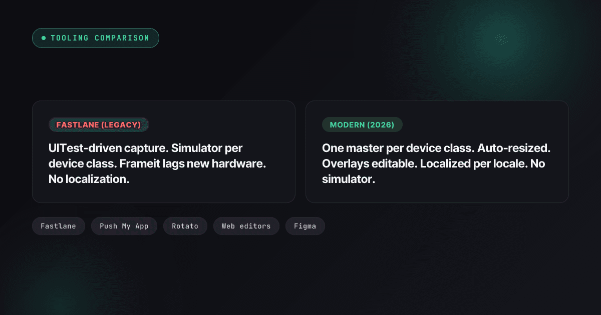
Fastlane Screenshot Alternatives: Modern Options for App Screenshots (2026)
Where fastlane snapshot and frameit stand in 2026 after the Mobile Native Foundation handover, what to replace them with, and a migration path that keeps the rest of fastlane.
Read

Screenshots & Assets
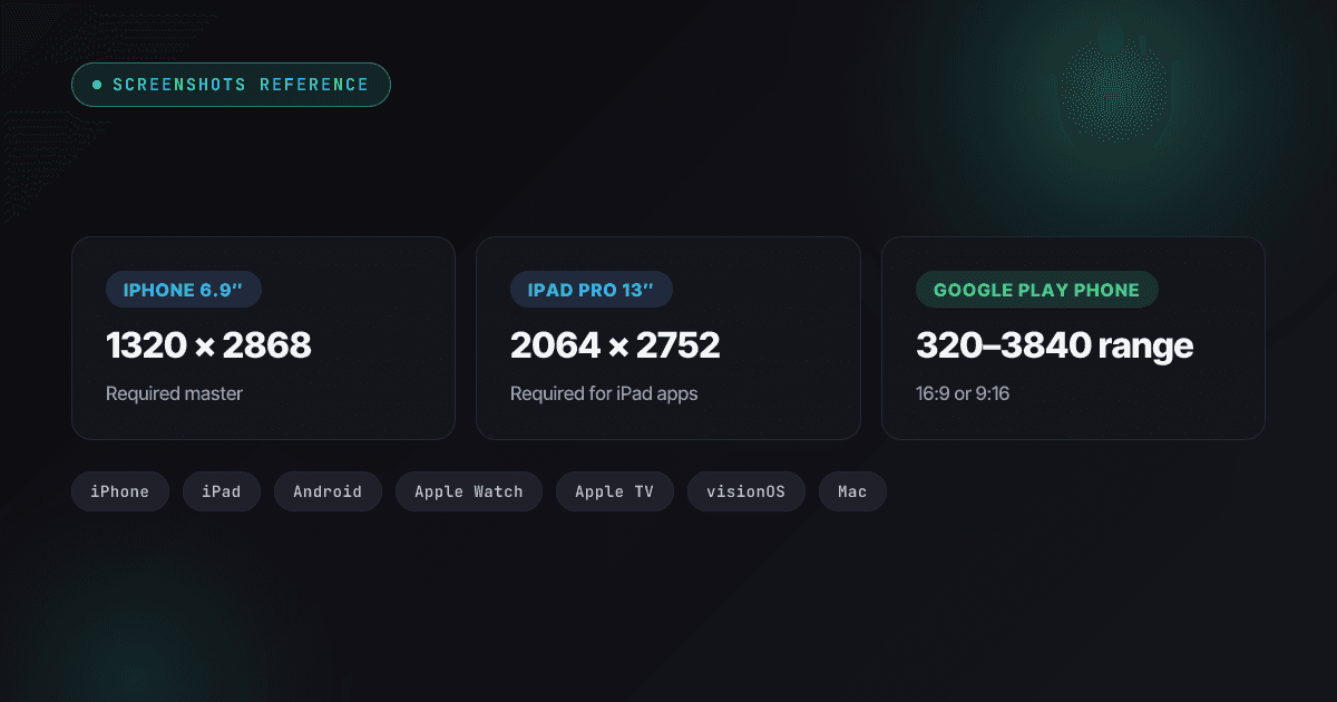
App Store Screenshot Sizes in 2026: Every Required Dimension
Every App Store and Google Play screenshot size for 2026 — the 6.9-inch iPhone class (including iPhone Air), iPad 13-inch, Watch Ultra 3, Play's 1080px featuring rule, and what auto-scales.
Read

App Store Rejections
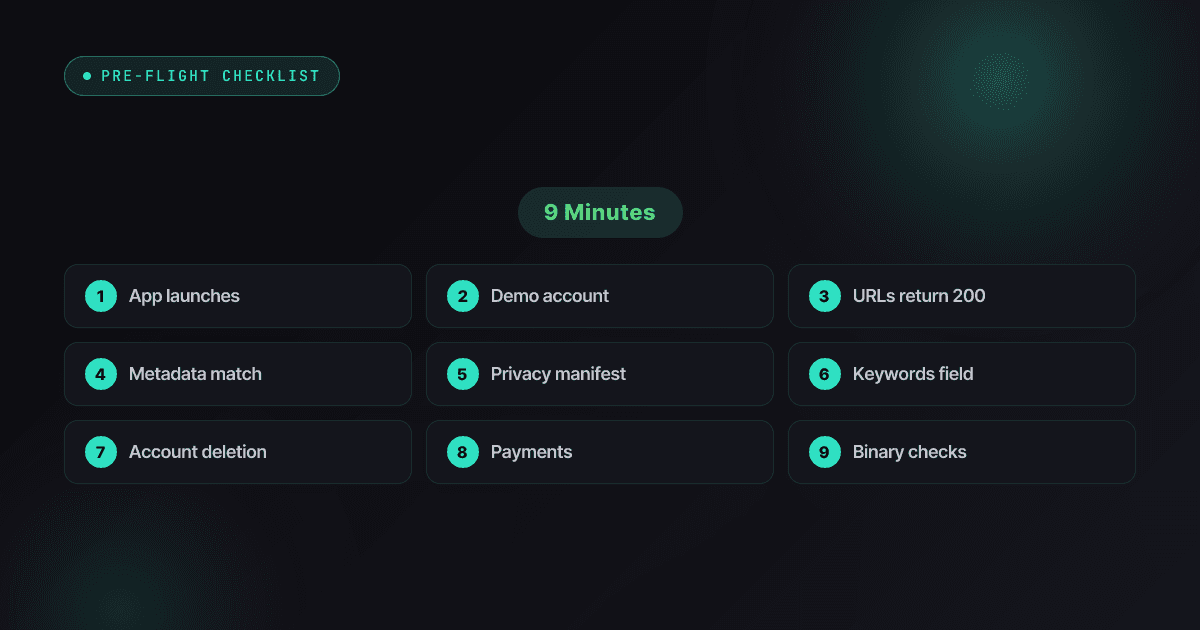
App Store Review Pre-Flight: A 9-Minute Checklist Before You Hit Submit
Nine one-minute checks that catch most App Store and Google Play rejections before reviewers do — updated for the Xcode 26 mandate, age-rating gates, and 2026 compliance fields.
Read